
Biases Introduced by the Fitting of Functions to Attitudinal Survey Data
Paul Schomer-
Schomer@SchomerAndAssociates.com
Schomer and Associates, Inc.
2117 Robert Drive
Champaign, IL 61821
Popular version of paper 1pNS1
Presented Monday Afternoon, Oct 17 , 2005
ASA/NOISE-CON 2005 Meeting, Minneapolis, MN
Understanding community response to noise environments such as those around airports, near highways, or near railroads remains an open question. Based on the seminal work by Schultz1 and others, researchers have sought to develop "dose-response" relationships by fitting curves through aggregated data that report some measure of community response versus some measure of the noise environment. Figure 1 shows the Schultz developed data and the curve that he fit to those data. Schultz used "highly annoyed" (HA) as his measure of community response and day-night average sound level (DNL) as his measure of the noise environment. One should note the significant scatter to the data. While the confidence intervals to the curve fit to the data may be tolerably small, the 90 percent prediction intervals are clearly quite large.
Figure 2 shows a more recent compilation by Fidell2, and one should note that with more data and more studies, the scatter increases. Figure 2 includes the dose-response relation espoused by FICON3 and especially the FAA, and the actual averages to the airport data in 5-dB intervals as calculated by Fidell. The data at 60 and 65 DNL in Figure 2 clearly show that assumptions about the curve fit to the data can bias the results. A second bias is the assumption that at a given DNL there is no difference between community response to airports vis--vis road traffic or railroads. It is obvious in Figure 2 that the airport data (red diamonds) on average lie above the road traffic data (blue squares) that on average lie above the railroad data (green triangles). In fact, except at very low noise levels, the second order polynomials fit to the railroad (red line) and airport data (green line) show that the railroad averages are always 10 to 20 percentage points lower than the corresponding airport data. The road traffic averages fit with the railroad data at low levels and with the airport data at high levels with a gradual transition in between.
Schultz uses a simple power function for his curve. He has two assumptions: the nature of the curve (a power function) and the assumption that the annoyance goes to zero at a DNL of 40 dB. He would have gotten a different curve if he assumed a different shape and/or that the annoyance only went to zero at 20 dB or at 0 dB. FICON assumes a transition function, a monotonic function that asymptotically goes to 0 percent HA at low levels of DNL and to 100 percent HA at high levels of DNL. So in this case there are three assumptions, the shape of the curve, the assumption that the percent HA function goes asymptotically to zero, and the assumption that the percent HA function goes asymptotically to 100 percent. These assumptions drive the value of the function at intermediate DNLs.
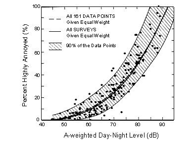
Figure 1. Original Schultz curve and data.
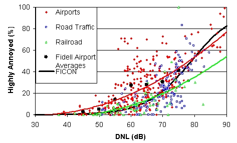
Figure 2. Fidell data and averages and the FICON curve fit.
FICON feels it "important" that the function go asymptotically to 100 percent HA and that the function be essentially zero at 40 DNL. But should we worry about the fitting function outside the region of interest and outside the range of the data? Do we really care what percent a function predicts at 100 to 150 DNL?
Figure 3 shows such a function fit to the Fidell data and Table 1 compares this fit to the FICON fit. Considering that this set of Fidell data is larger than the FICON set, the close comparison of the two fits in Table 1 shows that this is the fitting process being used by FICON. If anything, the FICON values are more extreme because they are, except for one, always a little smaller than the Figure 3 values.
Table 1 also gives the values of the Fidell airport averages and the differences between the FICON values and the Fidell airport averages. In effect, the FICON function fits the data well at DNL 40 and below, and they fit well to their assumptions at DNLs in excess of 90 dB. But the result is that their function does not fit the data well in the middle region (i.e., 55 to 70 DNL). Rather, the FICON function underestimates the true average of the data by more than fourfold at 60 DNL, which is convenient if one wishes to minimize the appearance of annoyance in EIS documents and the like. Clearly the biases to the FICON fit are large in the critical DNL region where people live and complain about aircraft noise. The great amount of "red ink" in Figure 3 again underscores the biases inherent in the assumptions used by FICON. Finally, to further underscore the biases, Figure 4 plots the differences between the Fidell airport averages and the FICON values.
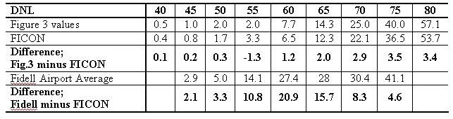
Table 1. Percent HA versus DNL for the cases indicated
Figure 3. Fidell data with a FICON type of curve fitting.
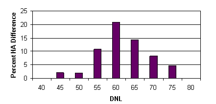
Figure 4. Difference between the FICON value at the indicated DNL and a true average of the Fidell airport data.